AutoWear Tiles
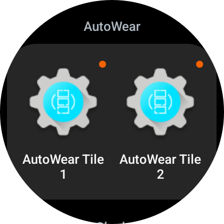
With this action you can configure Wear OS Tiles that you can add next to your watch face.
To add these Tiles swipe left on your watch face until you can add a new tile, then choose one of the available AutoWear tiles.
Tiles use pre-built UI components provided by Wear OS so the developer can not always change exactly how each element looks.
Common Properties
Texts
Each type of tile will interpret this differently. Check each type below for more info.
Text Colors
Color of each of the above texts. If you specify more texts than colors, the last defined color will be applied to the remainder of the texts.
Top and Bottom Label
2 pieces of text to show above or below the main content of the tile.
Bottom Button
An optional smaller button to show at the bottom of the screen. If only the text is set, its text will be used as its command. The command prefix will not be applied to this button's command.
Types of tiles that
don't support the bottom button:
Optional text to appear around the border of your watch.
In addition to normal text you can use the following special commands to add special elements around the watch's border:
- l=:=24 - would add a 24 degrees long line
- s=:=15 - would add a 15 degrees long empty separator
For example, if you would set the Border Text to Hello,s=:=5,l=:=15,s=:=5,There you would end up with something like this:
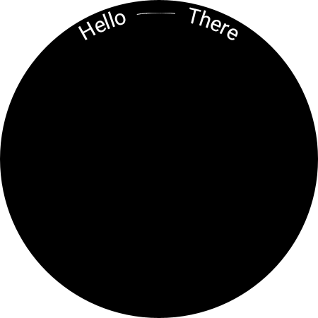
(The word Hello, followed by a space, followed by a line, followed by a space and then the word There)
Button Tiles
 Texts
Texts
Each text added here will create an individual button. You can add a maximum of 7 buttons, although not more than 5 is recommended, because they start looking weird.
Commands
Each command in the list will be assigned to the corresponding button. For example, command 1 on the list will be assigned to button 1, command 2 to button 2 and so on. If a button doesn't have a command, its text will be used as its command instead.
Command Prefix
If set, all commands (including the ones set by the button texts) will have prefix=:= prepended to them. For example, if you have 3 buttons with the commands "up,down,mute" and you set the prefix to "sound", the buttons will send the commands "sound=:=up", "sound=:=down" and "sound=:=mute" respectively. Make sure to use the AutoApps Command System to take advantage of this!
Button Color, Text Color, and Size
If set, this will change the corresponding properties of the buttons, button colors, text colors, or button sizes. If there are more buttons than there are defined colors, text colors, or button sizes, the last defined color, text color, or size will be applied to all remaining buttons. For example, if you have 3 buttons labeled "1, 2, 3" and only 1 color defined as "red," all 3 buttons will be red. However, if you have 2 colors defined as "red" and "yellow," the first button will be red, and the rest of the buttons will be yellow.
Progress Tiles
 Texts
Texts
This will be interpreted as a simple piece of text and will be put at the center of the screen, unless you specify an icon in the Progress Icon field.
Text List Tiles
 Texts
Texts
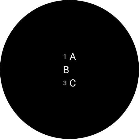
Each text here will be set as a new line of text on the screen.
Text List Headers
Each text here will be set as a header for each corresponding line added with the Texts field. For example, if you have 3 texts in the Texts field, you can add 3 headers here and they will appear on the left of the main text, on each line.
You can add headers to just some of the main texts by leaving some headers blank. For example, if your Texts are A,B,C and you set your headers to 1,,3 (notice the missing item between commas), something like this shows up:
Text List Sub-Headers
Same as the headers, but, if set, will appear between the header and the main text on each line.